The Recuyell of the Historyes of Troye and the Kelmscott Press
November 29, 2010
Description by John Plotz, Professor of English
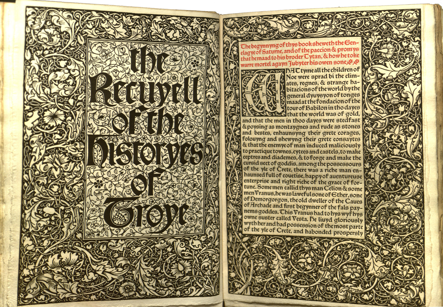 One of the most beautiful books Brandeis owns is the Kelmscott Press edition of “The Recuyell of the Historyes of Troye” (Rare — Versh PQ1570.A7 E5 1892) by Raoul Le Fèvre, a generous gift from Arthur Vershbow. When William Caxton first printed the Recuyell in Bruges in 1473-1474 it became the world’s first printed English book. William Morris’ decision to bring it out in the second year of the Kelmscott Press—and the way that he and his team produced the book that now sits in the Brandeis Special Collections Department—makes a remarkable story.
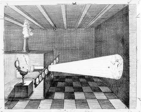 It sheds light not only on the Arts and Crafts movement that he spearheaded, but also on the entire history of modern bookmaking, which was born with one eye on history, and the other glued to the latest technology. In Morris’ case, that technology happened to be the magic lantern, which now strikes us as little more than a quaint device used for making shaky illusions in the pre-film era. But when we see the uses to which Morris put that lantern, the double-faced nature of the Kelmscott project, hyperantiquarian and hypermodern both, becomes crystal clear. No wonder that Morris’ daughter May early on dubbed the Kelmscott Press a “new-old industry.”
 I recently passed a downtown row house with an impressive historical marker, oval, dark brown and authoritative. My history-obsessed daughter halted us and together we solemnly read out, “On this spot, March 1, 1879, absolutely nothing happened.” Even in the most eventful life, most days are like that. The story of this spectacular book, though, begins on a day when something undeniably did happen. On November 15, 1888, William Morris went to a slide lecture by the skilled typographer Emery Walker at the Arts and Crafts Society. That night changed his life and the course of the modern book arts. It was that night that he saw a series of brilliantly colored magic-lantern slides of photographs of illuminated books, projected through one of the newly powerful (likely German-made) gas lanterns that were soon to revolutionize as well the study of art history. It was not the pages themselves (many of the slides were in fact made from books that Morris himself had given to Walker) but seeing how well these modern enlargements and illuminations conveyed the beauty of the originals that decided Morris. He would, after all, make the effort that he had since his college days considered and rejected countless times. The following morning he went to visit Walker and the provisional plans for the Press were drawn up. Less than three years later, in January 1891, the first book was made, a copy of Morris’ own medieval-inspired romance, “The Story of the Glittering Plain” (which Bostonians are free to examine at Harvard’s Houghton library).
 William Morris, writer, designer, socialist and founder of the Arts and Crafts movement, is the most talented and influential of those exceptional artistic polymaths who flourished in the age of Darwin. Like Darwin, or like George Eliot or Herman Melville, there was little he was not interested in; unlike those other greats of his day, there was also almost nothing he did not turn his hand to. Stained-glass (visit the Trinity Church in Boston to see a fine local example), house design, furniture, fabrics (check your uncle’s tie collection) and wallpapers are only a few of the “lesser arts” that he turned his hand to. Morris has been called (by Frank Lloyd Wright, Roger Fry, Nicholas Pevsner and others who should know) the father of modern design.
Although his designs, in books, houses, fabrics and glass, went on to become the basis of Modern design, and perhaps one of the key bases of Modernist art generally, he was history-obsessed in a way that few who followed him were (compare for example this gorgeous Doves press book, spare and almost obsessively typography focused, to the ornate illuminations of the Kelmscott books below). Morris looked backward to medieval and early modern workers for inspiration, not because they were made authoritative by the gap of centuries that yawned between, but because their struggles with their medium impressed him, as an artist, as the finest kind of aesthetic effort. His credo: “Have around you nothing that you do not know to be useful or believe to be beautiful” remains an inspiration to those who decorate or ornament their living spaces—but still more perhaps a guide to those who make those things. Morris always thought about producers and consumers, the makers and the deployers as partners in the process of making an entire beautiful life.
 He was also the de facto leader of English socialism during the unhappy late 1880s, when a string of disappointments, internal divisions and brutal government clampdowns (including one in Trafalgar Square that was the original Bloody Sunday) left the hopes of the radical left near total extinction. In the darkest days Morris published, in his remarkable socialist magazine Commonweal, a utopian novel, “News From Nowhere.” This was a blistering rebuttal of (Boston’s own) utopian capitalist novel, Edward Bellamy’s “Looking Backward.” In the century since, writers from Zamyatin (We) to Orwell—as well as a wide range of Labor and radical politicians worldwide—have been stimulated, irked and inspired by Morris in their darkest hours; the Kelmscott Press frontispiece of “News from Nowhere” has been reproduced countless times.
 Morris, though, never defined himself solely as a socialist. Even in the days of his most fervent lecturing and organizing for the party, he brought with him magic-lantern slides of cathedrals and unfinished manuscripts of epic poems (he liked to compose hexameter verse while weaving). Moreover, the grim news of the late 1880s turned him away from outright activism. By the late 1880s he was on his way to becoming something a lot more interesting than a card-carrying member: he left party politics, but without ever giving up on his ideals, or his efforts. The result was something rich and strange, but with the determination to make of it something very different from the main currents of his day. Morris’ formative encounter with John Ruskin’s 1853 “The Nature of the Gothic” (he was later to republish it in a memorable Kelmscott Press edition) had persuaded him to look back to the creative efforts of medieval workers for inspiration.
And so we come back to the choice that Morris made, a year into Kelmscott production, to reprint Caxton’s “Recuyelle.” Morris saw genius in the way that medieval workers had devoted themselves to expressing their individual insights in a durable medium that spoke to the hopes, fears and desires of all.
Morris was not merely parroting Ruskin, nor was he, as unsympathetic critics have sometimes alleged, merely a servile imitator of the past, a sterile antiquarian who loved the Middle Ages as a refuge from the present. In fact, his reasons for admiring medieval work had everything to do with Kelmscott’s curious double identity as half antiquarian, half radically new. He praised medieval art for its doubleness always. In fact, medieval books struck him as differing radically from their modern successors, being at once visually compelling (what he called “ornamental”) and narratively absorbing (“epical”).
 In fact it was Morris’ infatuation with medieval bookmakers like Caxton that inspired him, after Emery Walker had opened his eyes in November 1888, to found Kelmscott Press itself. The Press was Morris’ effort, in collaboration with artists of all aspects of bookmaking, to find in the early days of printed books inspiration for a thoroughly modern kind of beautiful object.
Although this is not the place to reconstruct the entire history of the early Kelmscott experimentation, it is worth noting that the creative process was a remarkable one for several reasons. No one before Walker and Morris had ever used magic-lantern slides of letters, blown up enormously as a template. And no one had ever before done what came next either. As Morris’ daughter May reports it:
Mr. Walker got his people to photograph upon an enlarged scale some pages from Aretino’s “Historia fiorentina” printed in Venice by Jacques le Rouge in 1476 and pages of all the more important 15th century Roman types. These enlargements enabled Father to study the proportions and peculiarities of the letters. Having thoroughly absorbed these, so to speak, he started designing his own type on this big scale. When done, each letter was photographed down to the size the type was to be … My father used to go about with matchboxes containing these “smokes” of the type in his pockets, and sometimes as he sat and talked with us, he would draw one out, and thoughtfully eye the small scraps of paper inside. (May Morris, “Introduction” to William Morris, “The Collected Works of William Morris,” vol. 15, The Roots of the Mountains, London: Longman, 1912), xv-xvi, xxii-iii)
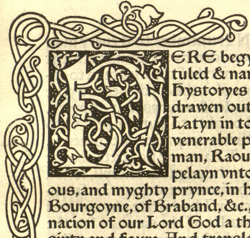
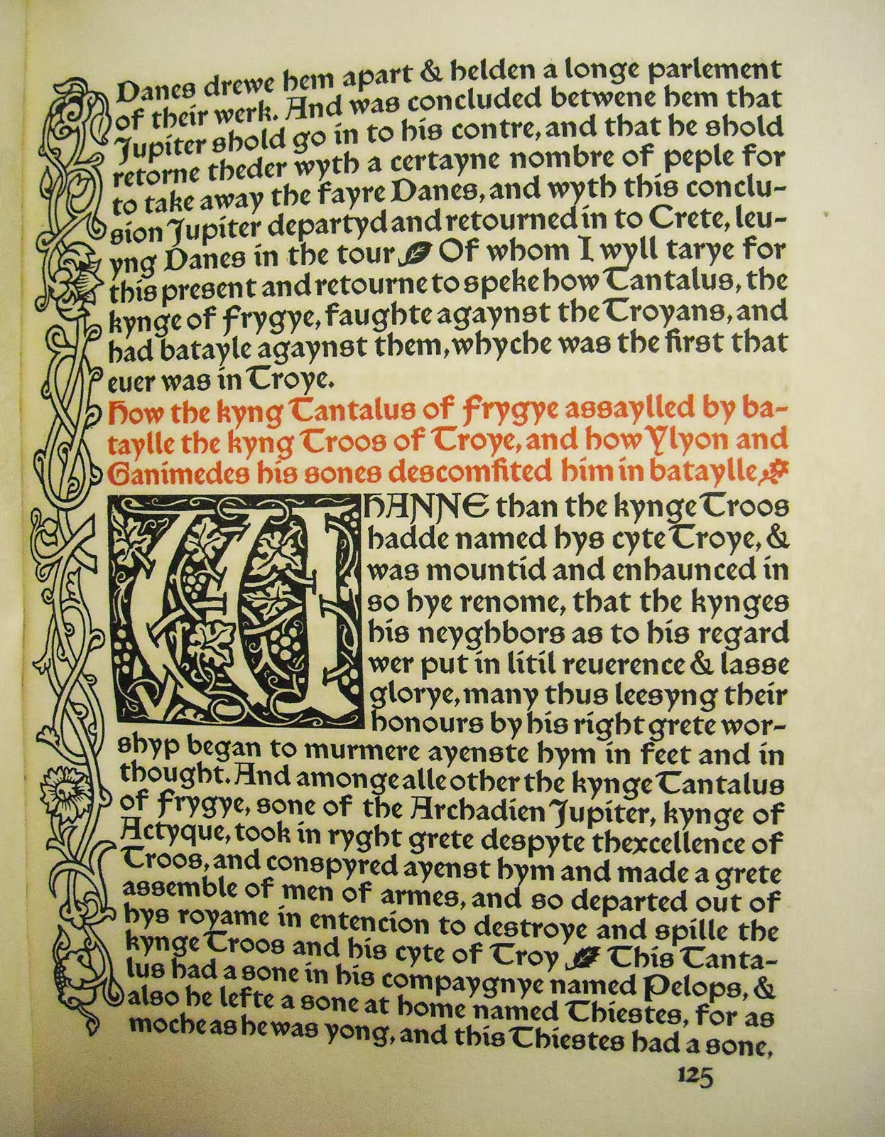
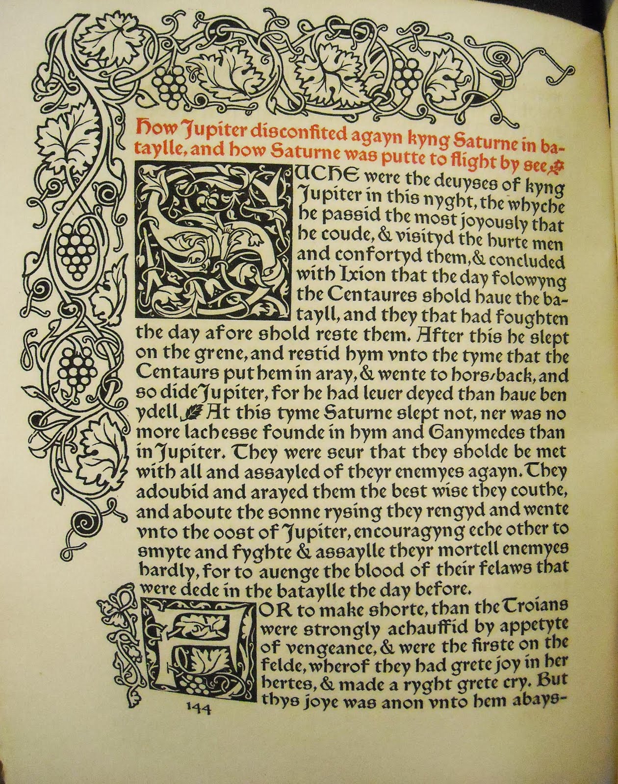
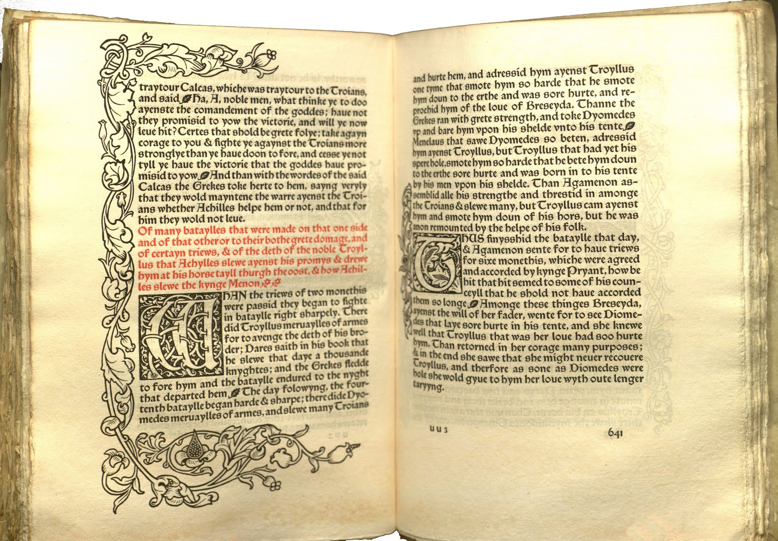
The book Brandeis now happily owns, “The Recuyelle of Troye,” is a crucial transition for the Kelmscott Press. The typeface experiments that May Morris describes led to the first type set Morris made, the Golden font. Though beautiful in its own right, Golden in some ways suffers from the laborious process of magnification, comparison and inspiration that went into its making. It suffers principally because although Morris took as his model Italian types, in his heart he was more drawn to the German (or Gothic, or black-letter, the name deriving from their thickness and blackness on the page) types. Though strangely beautiful, Golden is an odd in-between, a halfway house of a font.
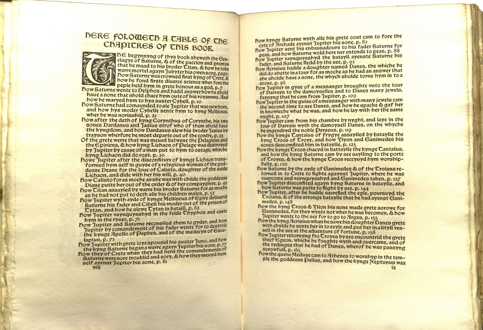 With The Recuyelle from Troye in 1892 (about the sixth book Kelmscott produced), Morris turned for the first time wholeheartedly to Gothic antecedents. The result was two separate typefaces, both seen in this book for the first time: the Troy and the Chaucer. One was an 18-point type that produces the remarkably vivid pages that you see reproduced here. And the other was a 12-point version, which is used here for the index and table of contents. This would later become the central font for the acknowledged masterwork of the Kelmscott press, the book known as “The Kelmscott Chaucer.”
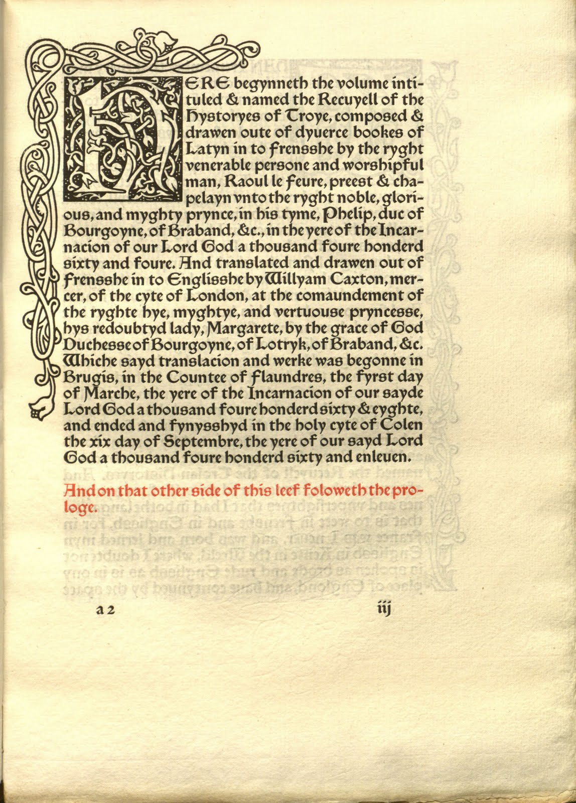 I stress that what you see is only a reproduction, brought to half-life on your screen, because Morris himself was so insistent on the requirement that readers encounter any book as a discrete art object in its own right. A book is not a mere carrier of text, he stressed, nor an accidental vehicle in which you can find your favorite stories—and perhaps some illustrations alongside. Look at a book in that dismembered way—and this applies equally to fetishists who only consider typefaces and paper, ignoring the story that the book tells—and you miss a crucial dimension that adds depth to an otherwise flat artwork. Care merely for text (or merely for book as thing), and you are walking around one-eyed in a wonderfully three-dimensional world.
This was the credo that he and Walker shared throughout their collaboration—and it explains why pages of his letter and writings are filled with musings on the correct ratio of white space to text on the page (high!) on the ratio between inner and outer, upper and lower margins (the lower margin must be the largest), and on the darkness of ink (as black as possible) — a credo that, taken seriously, will send anyone intrigued by these reproductions down to the Special Collections Department located on the second floor of the Brandeis main library to examine the book itself.