Usage Guidelines
The Brandeis University logo or sub-brand logo should appear on all print and digital communications that are primarily directed to external audiences.
Please note:
- You should not include both the Brandeis University logo and a sub-brand logo on the same piece as all sub-brand logos already include the main university logo in their design. Choose to use either the main university logo or a sub-brand logo.
- “Brandeis” or “Brandeis University” can appear elsewhere, in headline or body copy, for example, in a font and style that is consistent with the design of your piece (but the logo must always appear as well). Examples of this are below.
Placement and Color
![]() A variant of the Brandeis University seal has been developed for instances where the logo needs to be used at a very small size.
A variant of the Brandeis University seal has been developed for instances where the logo needs to be used at a very small size.
You should only use this simplified variation of the logo in cases where the seal displays at less than 5/8 inches in diameter, like a digital ad or business card.
In instances where multiple Brandeis units are represented, use the main university logo and list the various unit names underneath or elsewhere on the piece. Because the main university logo is part of the design for all sub-brand logos, you should not use multiple sub-brand logos on the same piece, as it will result in the redundant use of the university logo.
Incorrect Uses
- Do not manipulate or distort the Brandeis logo or any of its variants — for example by stretching or compressing it.
- Do not redesign any element of the logo or sub-brand logo.
- Do not substitute any of the typefaces in the logo or sub-brand logo.
- Do not add elements to the logo or sub-brand logo, such as a line, punctuation mark, or additional illustration.
- Do not combine the logo or sub-brand logo with any other marks, words, symbols, or graphics to create a composite logo.
![]()
Use Examples
Click on an image to see the full version. Please reach out to us if you need additional guidance and we will provide more examples.

Campaign design. Primary and accent colors are used.
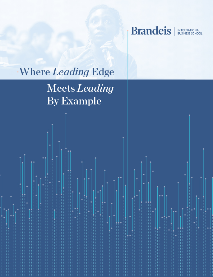
Print cover. A sub-brand logo, primary, secondary and accent colors are used.