Color and Graphics
People with color blindness often have difficulty distinguishing certain colors, such as red and green or blue and yellow. When color combinations (such as red text on a green background) are of insufficient contrast, the words can actually disappear to a person with colorblindness or other forms of low vision (cataracts, macular degeneration, etc.).
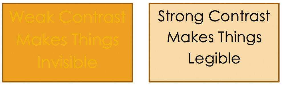
It is important to select strong, contrasting color combinations and directly labeling things that are otherwise distinguished only by color on a page (think charts and graphs). Remember to use high-contrast text, even when the text is actually in an image.
Colors should pass WCAG 2.0 AA standards for color contrast.
Check your color contrast ratio
Expand All
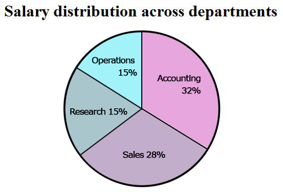
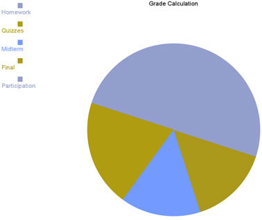
Make sure that the colors you use in you graphs or chart are high contrast. This example is easy to distinguish, but only if you can see the colors as intended:
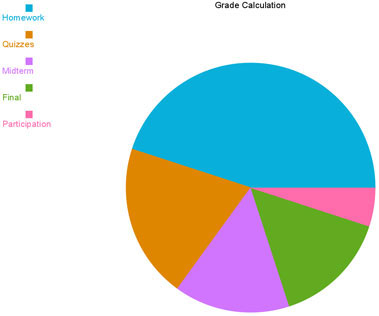
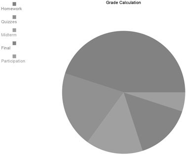
Below is the same pie chart as seen with two kinds of colorblindness
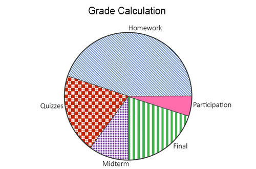
Don't use color as the only way to convey content. You should also use direct text labels or changes in shape or texture. In the following example, the graph has its parts directly labeled, instead of relying on color matching with a legend. It also uses texture instead of color, to distinguish its elements. Although the graph below uses text labels and texture to differentiate between sections, you do not need to use both.
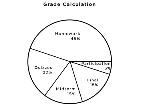
This simple example is accessible as is, because it is high-contrast and directly labeled. Of course, it is an image, so don't forget to add alt text.
To add color to this example, use any colors that are high-contrast to black.
Here is an example of "fixing" an inaccessible pie chart
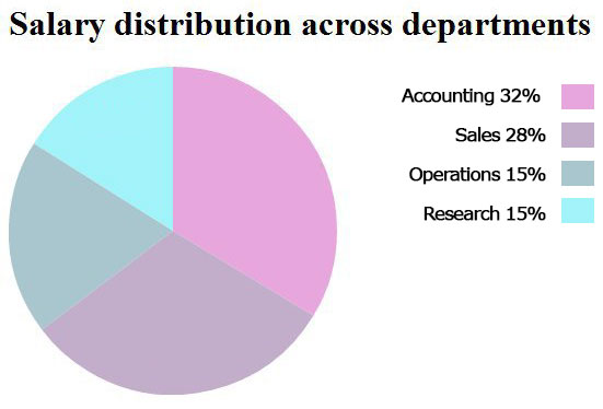
Inaccessible
Accessible