Feature Boxes
The Feature boxes content type is similar to a Gallery in that the images are displayed in a uniform manner, but with a feature box, you can add text that overlays on top of the image, and make the image clickable. Feature boxes can only be used in the main content area.
(See two sample feature boxes added to the main content area below.)
Adding a Feature Box to the Main Content Area
- Navigate to your page and click Edit.
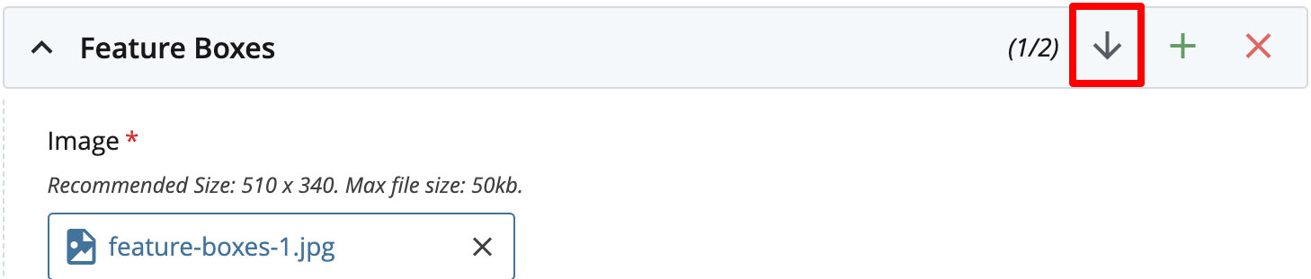
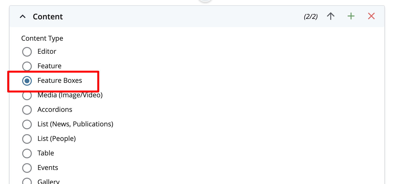
- In the Content section, Feature Boxes from the drop-down menu. It defaults to a single Feature Box.
- Note: If your Feature Box needs a headline, you must add that using an Editor above the Feature Box content type.
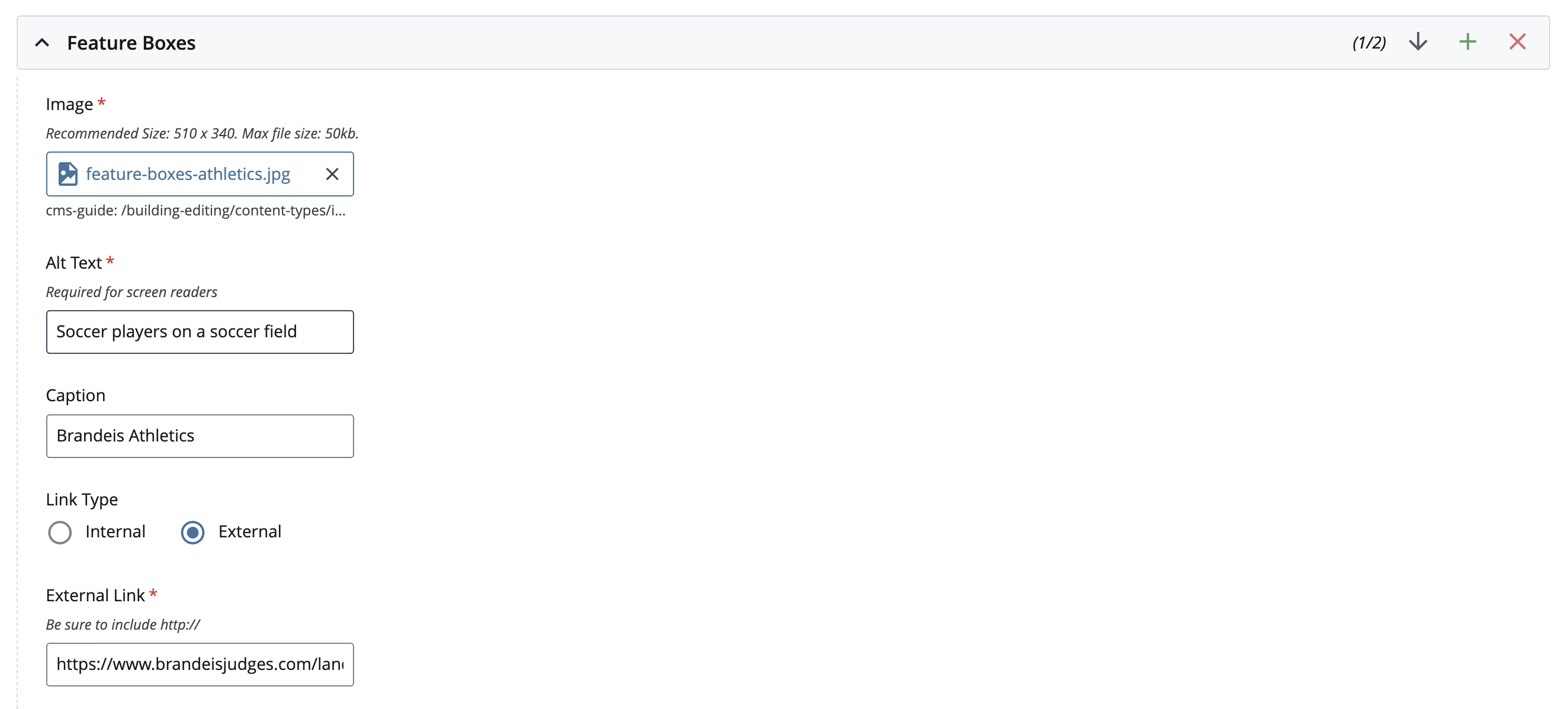
- Image (required): Browse for the image you wish to upload (510 px x 340 px). Add alt text for the image.
- Caption (optional): Add text to overlay on top of the image.
- Internal/External Link (required): If you are using an Internal Link, click Choose File, Page, or Link. In the Chooser Panel, you can select a recent internal page, or browse for an internal page. If you are using an External Link, enter the URL, including the http://.
- If you wish to add a second Feature Box, click the green plus sign to the right of Feature Boxes. You can continue to add as many feature boxes as you wish.
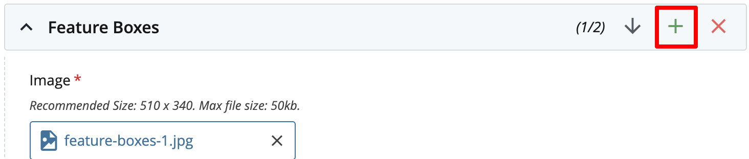
- Feature boxes are added in this order: top left, top right, bottom left, bottom right, etc. Use the arrow to reorder them.