Responsive Web Design
The standard university templates are responsive. In other words, they offer a seamless and attractive user experience across all devices (mobile, desktop, tablet). But what does that really mean, and how does it affect how you manage your website?
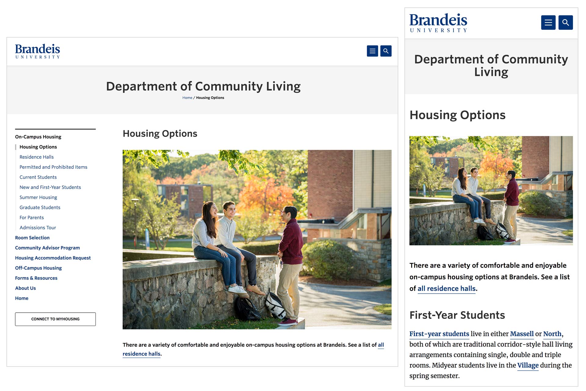
Image on the left is one way the Brandeis homepage might show up on desktop; on the right, how it might look on mobile
Flexible Layout
The standard university templates use a number of content types that have been designed specifically for the Brandeis website. In responsive design, content needs to adjust (rearrange and stack) depending on the screen size. This ability to rearrange is very important for the responsiveness of the site, and for this reason, it's best to use the appropriate content type when building your site. This will ensure your content is formatted and aligned optimally for responsiveness. In other words, you may be able to build a table in a regular WYSIWYG editor, but it will not be responsive, so you need to create it using the Table content type.
Image Sizing
In the standard university templates, image size requirements are based on the content type. It is important to upload images at the specified size, so they appear correctly on any screen size or device.
You can see how images and content change by going to the Office of Marketing and Communications site and adjusting the width of your browser.